
November 9, 2016 (Original Post date)

Written by: Nayomi Chibana (Visme.com)
Please click here to view the original blog post by Visme.co
Our Top Picks from the Best Infographics
1. Dear Data
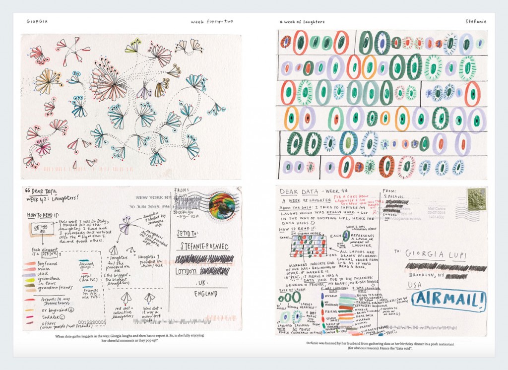
One of the most unconventional data visualizations of the year has to be this series of hand-drawn infographic postcards.
The result of a year-long correspondence between two information designers, these delightful infographics stray from the norm by visualizing personal, everyday experiences.
If you want to learn how to become a more creative visual thinker, just take a look at how Stefanie Posavec visualized her “week of complaints and general grumpiness,” or how Giorgia Lupi visualized the sounds she heard throughout the week.
2. Occupations at the Ballot Box
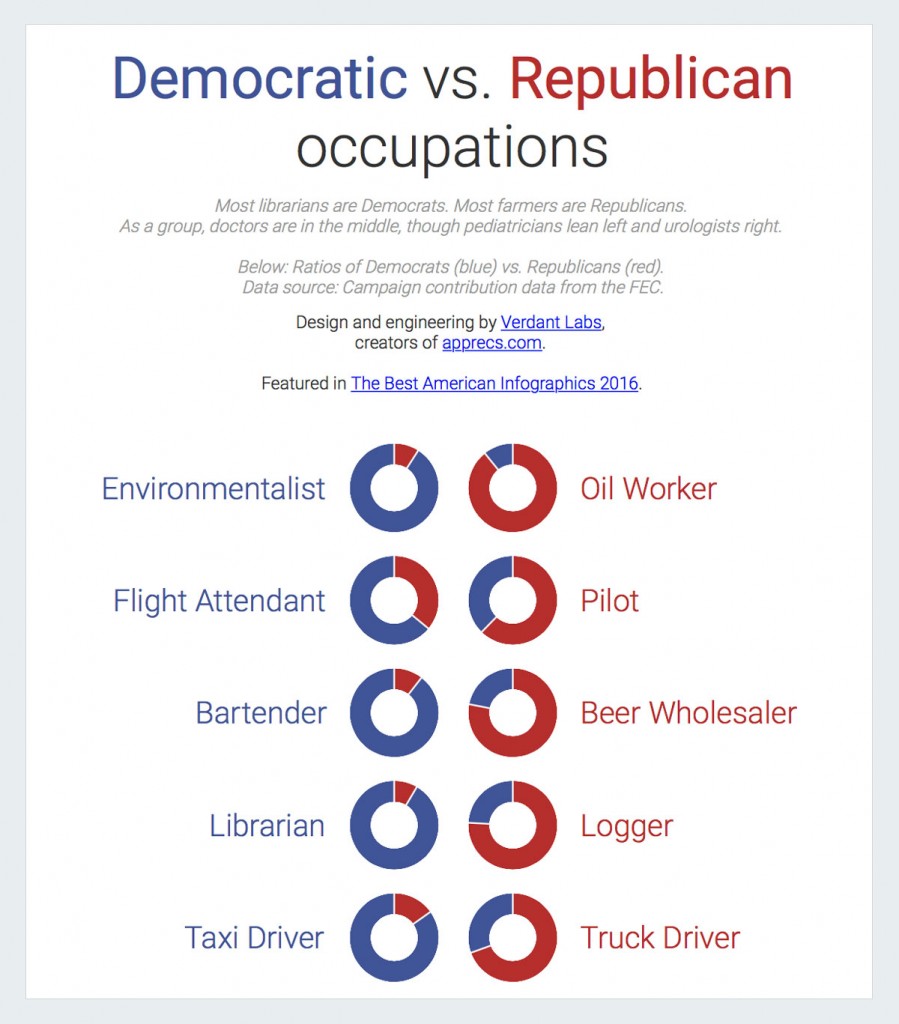
Another favorite infographic of ours–and a great conversation starter–is this one by Verdant Labs. Through a simple but revealing series of doughnut charts, software engineer Mark Edmond gives viewers unique insight into the political inclinations of certain occupations.
For example, did you know that your urologist is significantly more likely to be a Republican, while it is far more probable that your pediatrician is a Democrat?
3. Smell the City
If you’ve lived in a big city long enough, odds are that you’ve probably run into some questionable smells from time to time.
To inspire a whole new line of research into the role smells have in urban design, the Smelly Maps project is an interactive odor map that visualizes the “olfactory footprint” of different cities around the world.
Whether you’re traveling through Paris or live in New York, you can click on any street or corner and explore the different smells in a certain neighborhood.
4. The Atlantic Slave Trade
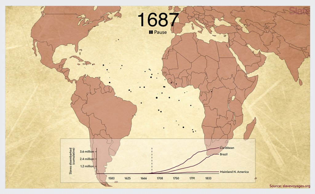
We usually think of North America as one of the most prominent players in the Atlantic slave trade from the 16th to the 19th century, but the reality is that the majority of African slaves were taken to the Caribbean and Brazil.
This animated interactive visualization proves it. In just two minutes, it gives you an overall picture of the scale of the slave trade, from 1545 to the 1860s. Over 200,000 voyages are depicted through dots that represent slave ships, each sized in accordance with the number of enslaved people on board.
5. Life During Wartime
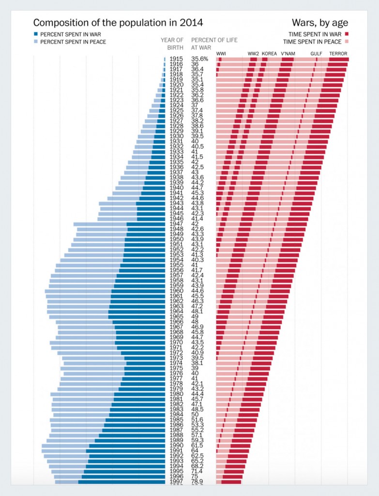
Despite the belief that the world is less violent now than it’s ever been, the fact remains that the country has been at war for almost the entire 21st century.
This infographic reflects how every living American has spent a surprising amount of his or her life living in a country at war, although only a relatively small percentage of the population has experienced it first hand.
6. Who’s Buying American Elections
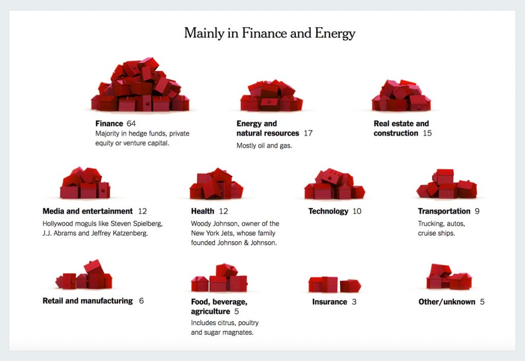
Who’s Buying American Elections
This eye-catching infographic article puts on display an uncomfortable truth: Only 158 families have funded nearly half of all presidential campaign efforts in this 2016 election.
Through the use of 3D software to model what 120 million Monopoly houses would look like, the New York Times was able to provide readers with an unusual yet provocative visualization comparing the total population of American households with the tiny percentage of families that are actually paying for the elections.
7. Every Candidate Talks Like a Book
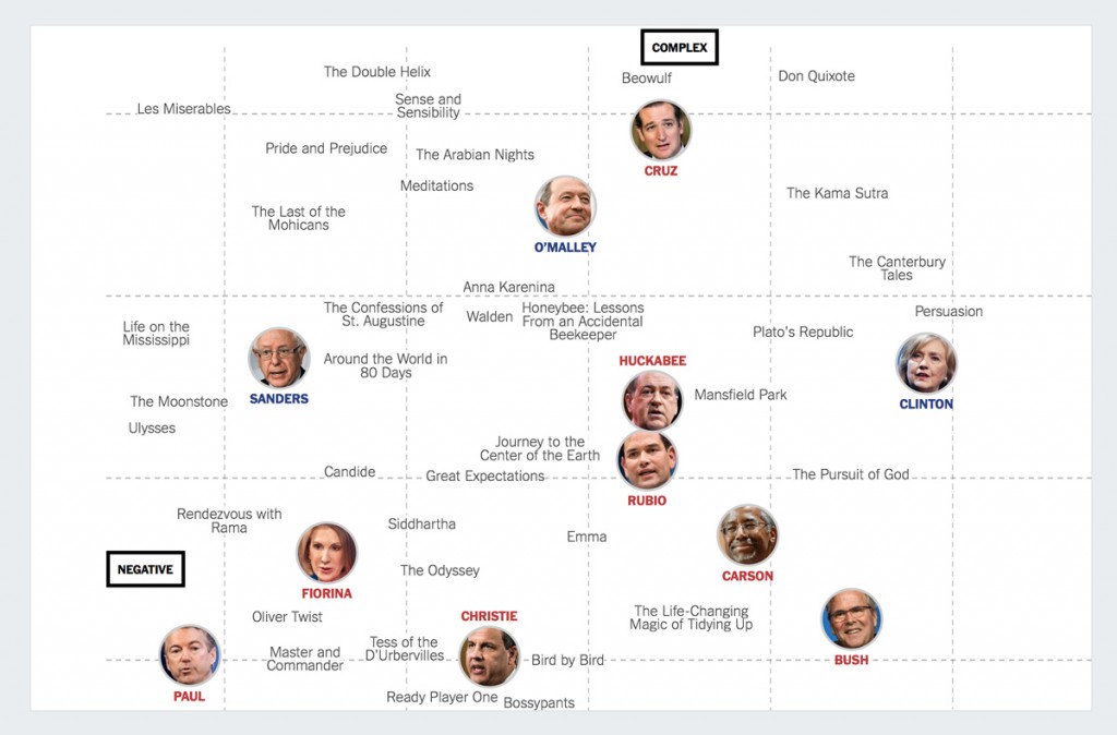
Matching Presidential Candidates With the Books They Sound Like
The best infographics always make sense of seemingly disparate data by placing it into context. In this case, the New York Times endeavored to analyze presidential candidates’ speaking styles in terms of complexity and how positive or negative their messages were.
To provide some perspective to this visualization, the creators also analyzed commonly downloaded books according to this same criteria and plotted the results on the same graph.
Did you know that Trump speaking style is at the same level as Hans Christian Andersen’s Fairy Tales? Or that Ted Cruz’s speech is comparable to an excerpt from Beowulf?
8. Refugee Flows
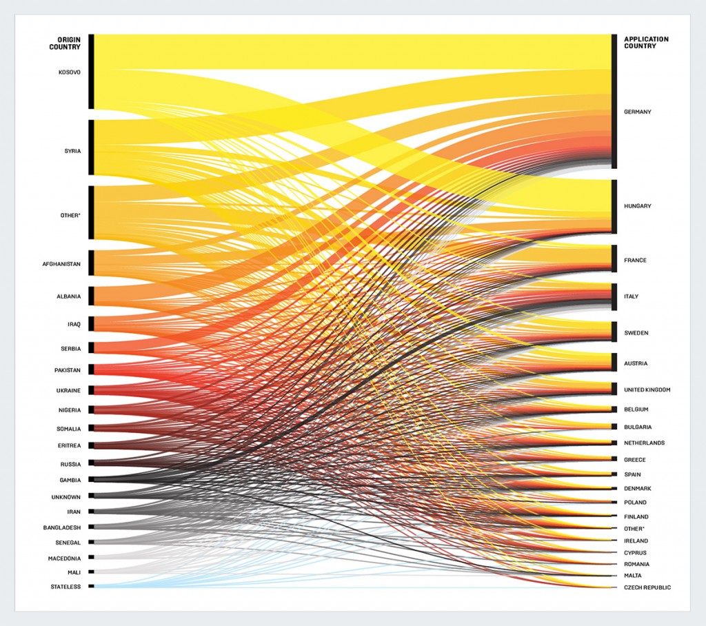
The very best infographics not only put data into perspective, they also allow readers to process loads of complex information in a matter of minutes–sometimes seconds.
Take, for example, this alluvial diagram published in Foreign Policy magazine. Viewers uninformed of the migrant crisis in Europe can quickly get a sense of who’s going where and in what numbers.
You can see that a majority of refugees are fleeing Kosovo and migrating to Germany and Hungary. The next largest group is comprised of Syrians seeking refuge in Germany, Hungary, Austria and Sweden.
9. Sketch Artists in Chief
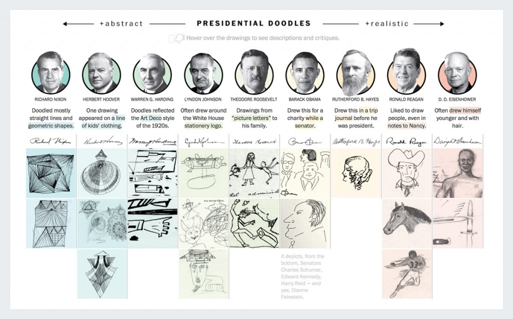
This interactive visualization is particularly amusing for those who like to psychoanalyze famous people based on their handwriting and drawings.
Here, the Washington Post provided samples of past American presidents’ doodles and asked four cartoonists to evaluate them, without knowing the name behind the drawing.
For example, take a look at Warren G. Harding’s slightly disturbing drawing, or at Obama’s “artistic talent.”
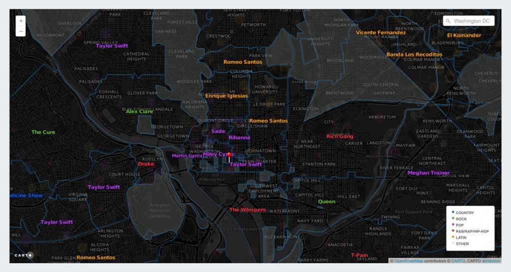
10. What the Jukebox Knows
Fascinated by obscure data that can act as a proxy measurement of larger social trends, Elliott Ramos of the Wall Street Journal created this interactive map of local jukebox selections.
The results are curiously reflective of socio-economic and ethnic information for each region. Notice, for example, how hip hop, R&B and rap are prevalent in the southeastern part of the United States, while diversity persists in large urban areas such as Los Angeles, where you’ll find everything from alternative rock to Latin pop.
11. Stories of Past and Future
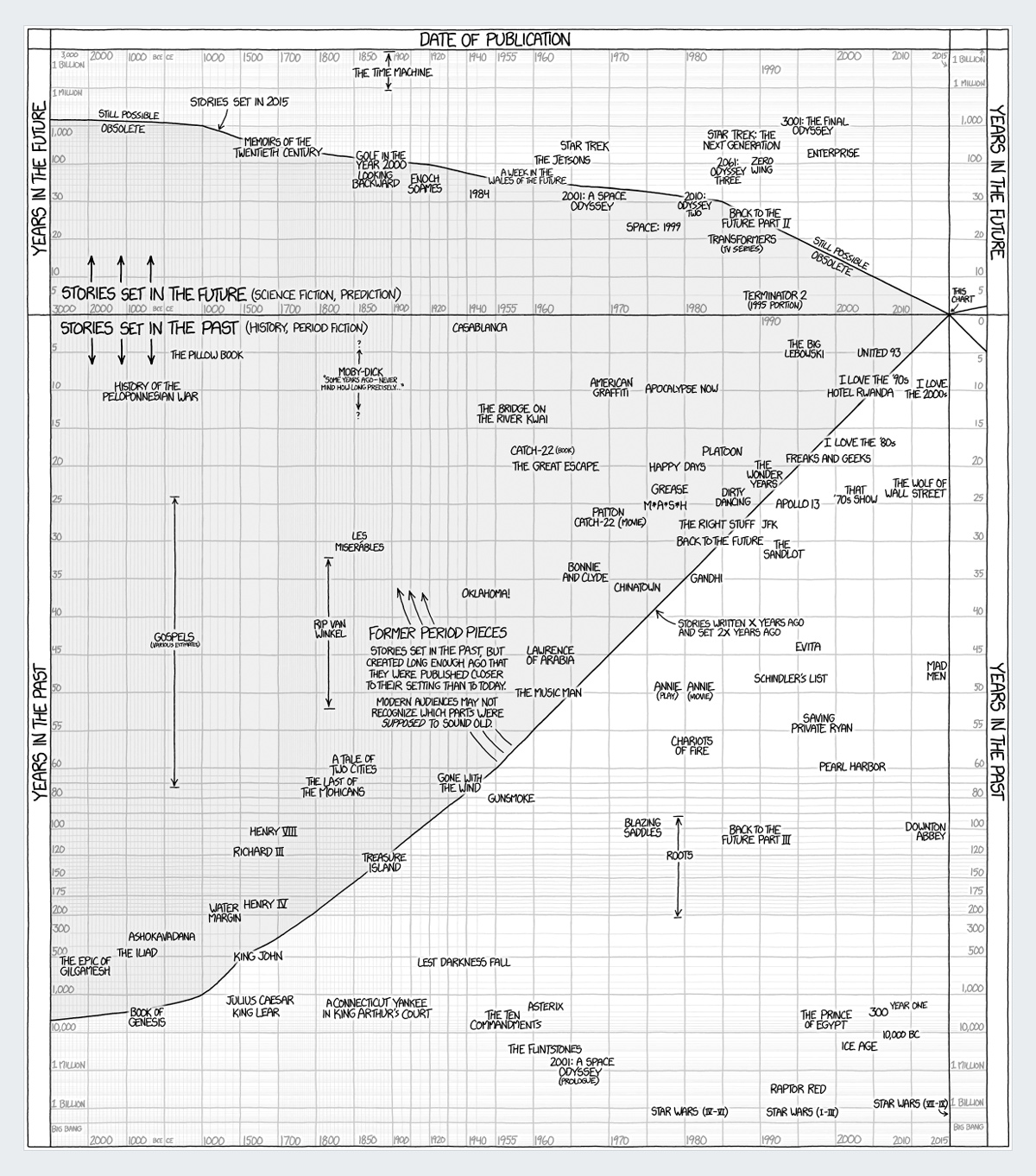
For those who love a good story, you’ll also find this hand drawn visualization entertaining. It maps out all stories that were ever set in the future or the past in one graph.
While you may have to spend a little time familiarizing yourself with what each axis, line and label means, it’s an interesting read for those who have time on their hands to review futuristic movie titles created several years ago and see which of these still have the possibility of becoming a reality.
12. The Syrian Death-Toll Flag

Another telltale sign of a good infographic is that it has the power to influence the way readers think about events in the world.
This infographic by the Washington Post, for example, does just that by visualizing the sheer magnitude of the death toll due to the Syrian conflict.
Each one of the 220,000 people killed in Syria is represented by an individual dot in this Syrian flag. This makes it easier for readers to visually grasp what this figure means and differentiate it from other large-sounding numbers like 22,000 or 2,000.
13. From “Uncle” to “Thang”
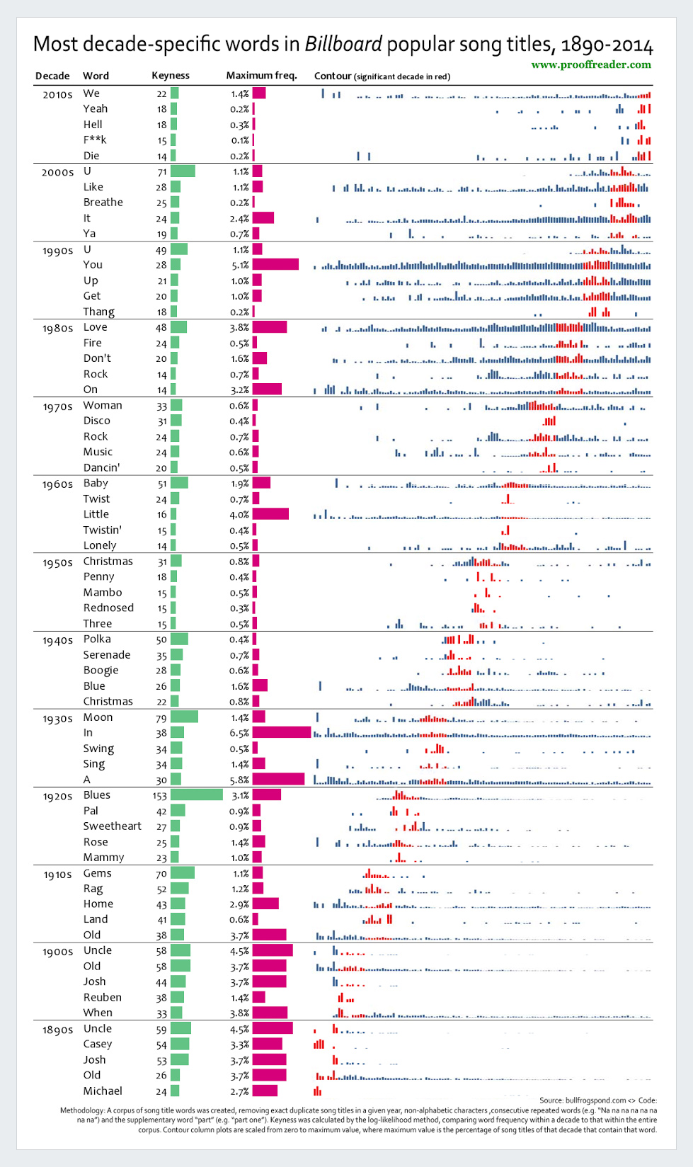
And for those who are interested in the social findings that can be gleaned from the evolution of music, here’s an infographic that explores how the words in song titles have changed over the years.
Over the span of 126 years, we’ve gone from “Uncle” and “Old” to “Thang” and “Die.”
14 .Who’s Fighting Whom in Syria
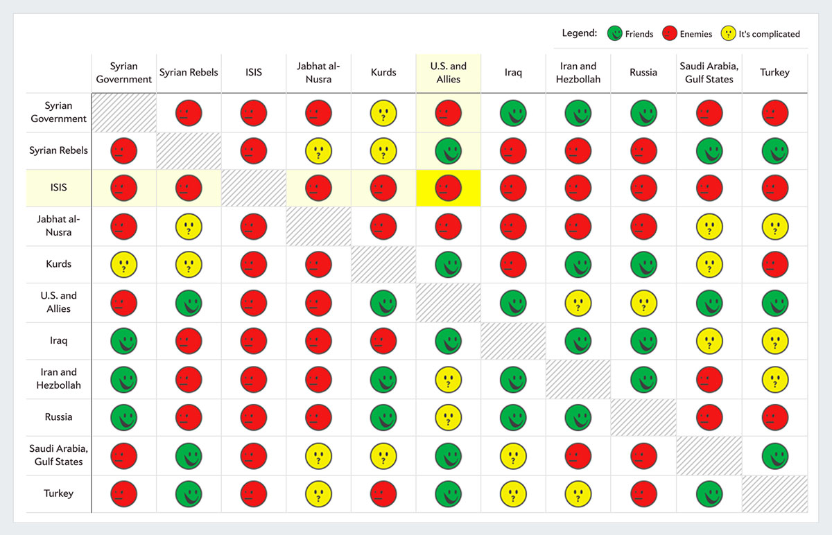
This interactive visualization is a must-read for all those interested in understanding the mind-numbing complexities of the Syrian conflict.
To make sense of all the groups involved and their alliances and rivalries, Slate sorted them into a chart, with a legend labeling each pair as “friends,” “enemies,” or “it’s complicated.”
For example, by simply clicking on the cell at the intersection of Kurds and Syrian rebels, we see that the relationship between the two is rife with suspicion and unclear intentions.
15 .How to Hack Science
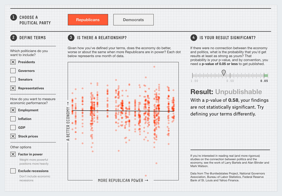
This revealing interactive visualization attempts to show readers that you can use statistics to support any point of view–it all depends on which parameters you choose.
Known as “p-hacking,” the practice of tweaking the selection of parameters in an experiment to achieve a statistically significant result is often regarded as dishonest, which is why some journals now require descriptive statistics, not just a publishable p-value.
To see for yourself how this works, click on the different parameters and tweak them until you reach a publishable p-value.
16. Who Pollutes and Who Suffers the Most
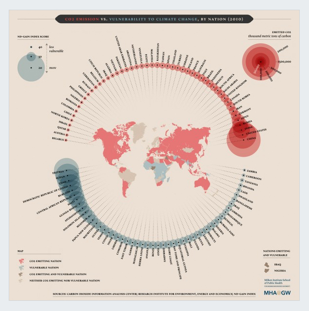
Who Pollutes and Who Suffers the Most
This easy-to-read map shows who’s mostly responsible for CO2 emissions in the world and, on the flip side, who suffers the most from climate change.
At the top of the list are well-known culprits such as the United States, China and India, and on the receiving end are vulnerable nations such as Eritrea, Sudan and Chad.
In the middle are also countries that both pollute and are vulnerable to climate change, such as Portugal and Scandinavian nations.
Your Turn
Which of these was your favorite infographic? If you have a piece you think should be considered as one of the best infographics of 2016, don’t hesitate to share it with us in the comments section below.
And if you would like to try your hand at creating your own infographics or interactive maps and charts, you can try Visme here for free.
Please click here to view the original blog post by Visme.com


