November 11, 2016 // 8:00 AM (Oiginal post date)
The Anatomy of a Lead-Generating Website
Written by Lindsay Kolowich | @lkolow

Your website is the most important tool you have for turning prospects into customers.
There are plenty of ways to increase the number of people visiting your site, but unless you convert these visitors into leads, you won't be able to ultimately get new customers. As a result, your business won't be able to grow at a healthy rate.
That's why it's so important to design your website with lead generation top-of-mind.
Think about what your website looks like in its current state. Do each of your webpages clearly guide visitors to take action, or does they leave them wondering what to do next? Do you use a tool that automatically pulls the submissions from your forms and puts them into your contact database? Are you creating custom landing pages for every single campaign that you run? Do you have lead generation CTAs on each of your blog posts? (Do you have a blog at all?)
If you're starting to think hard about the opportunities you have to increase conversion on your site, you've come to the right place.
In this post, we'll cover the most critical components of a website optimized for lead generation. You'll find useful tips in here whether you're coming from a startup generating leads from scratch, or from a well-established business looking to tighten up your website to increase conversions.
The Anatomy of a Lead-Generating Website
1) Lead generation forms
Forms are the crux of any business' lead generation efforts. Without them, you won't be able to get contact information that your site visitors actually opt in to give you. The opting in part is important: When people voluntarily hand over their information by filling out a form, they're actively showing interest in your business, your products, or your content. These leads are valuable because they're more likely to turn into customers down the road.Embedding lead generation forms directly on your website makes it easy for visitors to convert into leads. If you're a HubSpot customer, you can create forms right in HubSpot and either add them to your webpages or embed them elsewhere. Non-HubSpot customers can turn to form-embedding tools like Contact Form 7, JetPack, or Google Forms.
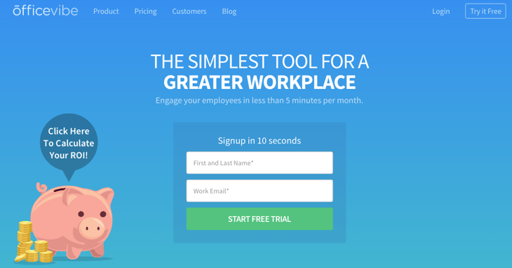
Although landing pages are the most popular places to put lead generation forms, you can embed them anywhere you'd like on your site. Here are a few examples of forms from different businesses that have with different goals, starting with OfficeVibe's homepage:
On AdmitHub's homepage, they've embedded a form for a demo request:

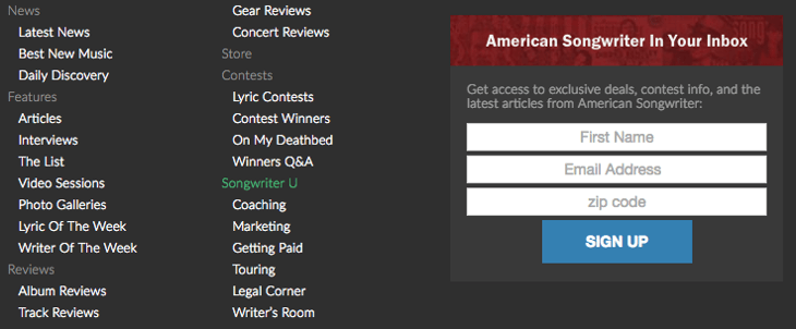
The folks at American Songwriter embedded a subscribe form in the footer of their website:
Below is the form on ChoiceScreening's "Contact Us" page. You'll notice it's relatively long, but for a business that runs background checks of all kinds, the form fields are likely necessary to help organize inquiries.
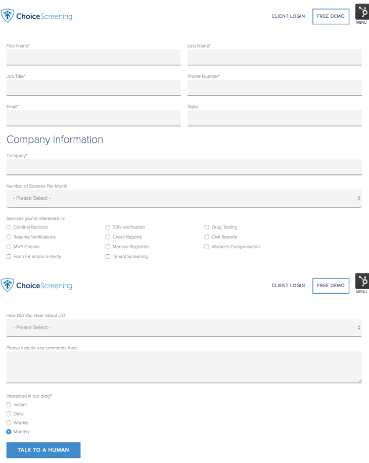
When you're thinking about how long your forms should be, consider whether you'd rather have more inquiries coming in, or higher quality inquiries coming in. As long as you have other, easier avenues for folks to contact you, a longer form can be okay for some businesses.
2) A form scraping tool
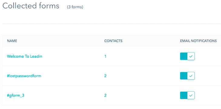
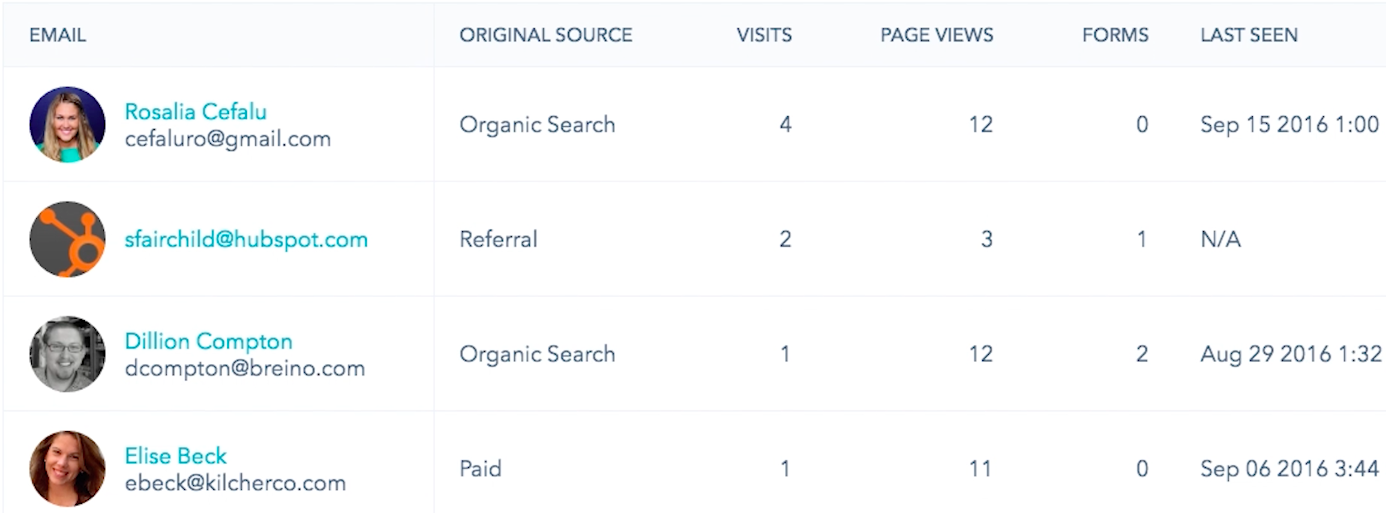
Once you've created and embedded your forms, how are you going to collect and track submissions? You'll need a tool that scrapes your forms, meaning it automatically captures the form submissions on your website and puts them into your contact database.By consolidating your leads in one place, it'll be much easier for you to follow up with those leads -- whether it's by sending them lead nurturing emails, tracking their future behavior on your website, or some other action.
We recommend using our free Collected Forms tool, part of HubSpot Marketing Free. Collected Forms enables you to detect form submissions on your website as they come in -- even if the forms are not built with HubSpot. Then, it'll put those submissions right into your contacts database.
3) Primary and secondary calls-to-action on every page
When people go to a website, they're usually trying to take some action. Sometimes, they know what that action is -- like when you're looking for a coffee grinder to buy for your spouse's birthday and you plan to make a purchase as soon as you find one that's good enough. Other times, visitors simply don't know what they want to do on a website and they're just there to browse or research.It's your job to guide these people forward in their research and/or buying process through calls-to-action (CTAs). Remember, your website exists to compel visitors to dig deeper into your business and offerings and move them further down the funnel. CTAs tell them what to do next so they don't feel lost or overwhelmed. In this way, CTAs turn your homepage into a lead-generating machine.
You'll want to create multiple CTAs for your site that speak to different parts of the buying funnel. But it's important to have a primary CTA -- one that exists above the fold of your site pages, sticks out from the others, and leads people to do the #1 thing you want them to do on each page.
What that CTA leads to will depend on your end goal. What do you want your site visitors to do most -- do you want them to sign up? Create an account? Request a demo? Defining what a "lead" means to you will make your analytics goals much clearer and will help you build a more intuitive funnel.
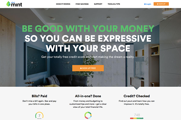
Here are two examples of webpages that effectively use primary CTAs to direct visitors to the next logical step. The first is Mint's homepage, where you'll notice the free sign-up CTA immediately draws your eye:
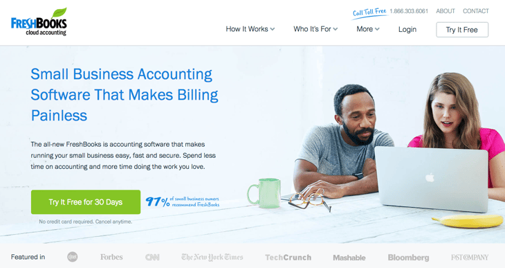
Here's another example from FreshBooks' homepage:
Common CTA examples include "Free Trial," "Schedule a Demo," "Buy Now," or "Learn More." (Here are 30 examples of great CTAs for more inspiration.)
4) Gated offers on landing pages
We already went over the importance of embedding forms on your website in a more general sense, but landing pages deserve a section of their own. Landing pages are the hub of your lead generation efforts -- which is why every marketing campaign you run and every offer you create should be tied to a custom landing page.The more landing pages you have, the more opportunities you have to convert site visitors into leads. There's also a huge SEO benefit to having more landing pages, which can have an impact even before visitors land on your site.
There are many elements that a top-notch landing page needs, from design to form length to navigation, share buttons, social proof, and so on. If you're looking for detailed information on building well-designed landing pages that are optimized for lead conversion, here are a few helpful resources:
- 7 Key Design Tips for High-Converting Landing Pages (blog post)
- How to Optimize Landing Pages for Conversions (free ebook)
- 16 of the Best Landing Page Examples You Need to See (blog post)
- How Long Should Your Landing Page Forms Be? (blog post)
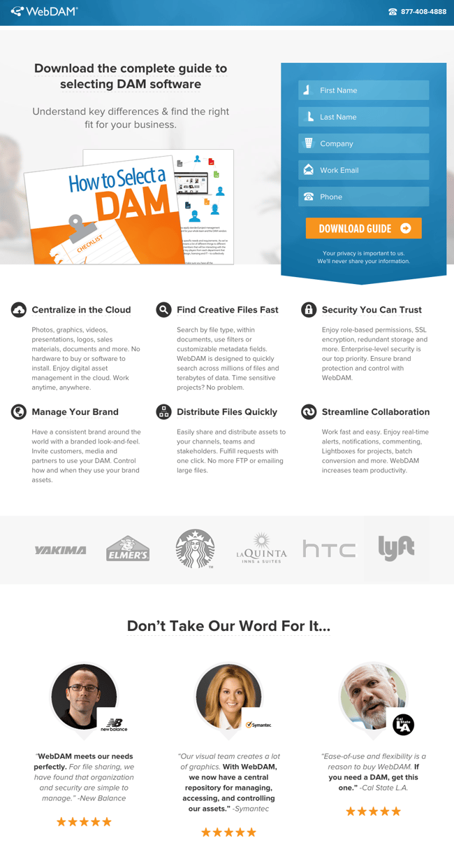
Below is a great example of a landing page from WebDAM. While it's a solid example overall, the form might be the best part -- especially the little icons in front of the text that refer to the information needed to complete it.
If you're looking for ideas for valuable content to put behind those landing pages, read this list of 23 lead generation content ideas to start you off.
5) Pop-up forms
I know, I know. "Pop-ups" can sound like a dirty word nowadays. Inbound marketers everywhere are asking themselves whether they should be using pop-up forms -- and the short answer is yes, as long as you use them in an inbound-y way.To do that, you'll want to make sure you're:
- Offering something valuable and relevant so they add to your website visitors' experience, rather than interrupting it;
- Timing their appearance so they're triggered by certain actions or time spent on a page in a way that feels natural and not interruptive;
- Using language that's actionable and human;
- Not ruining the mobile experience.
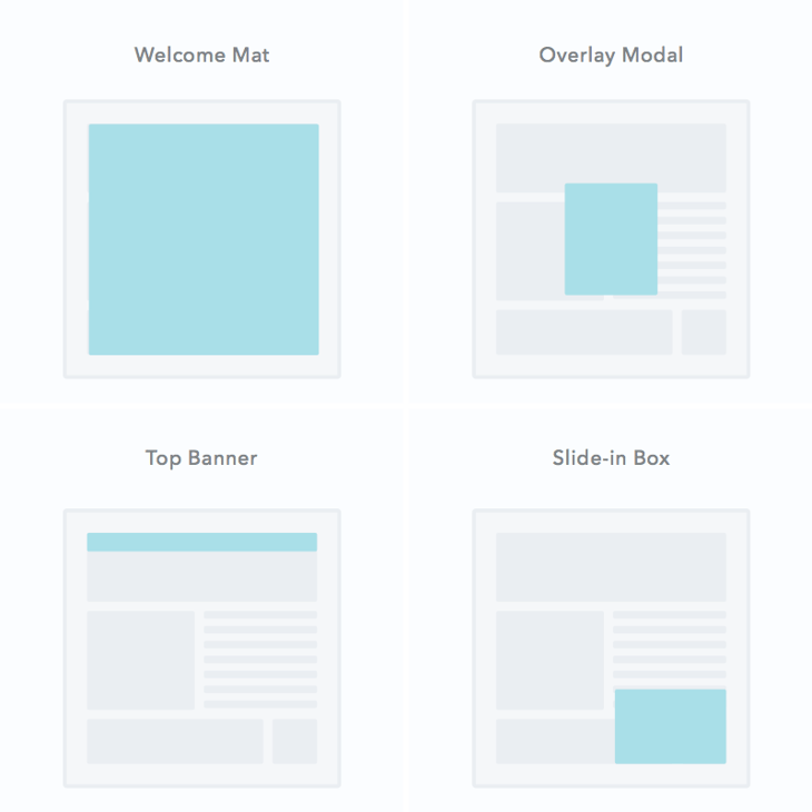
In addition to embedded forms and traditional call-to-action buttons, you'll also want to pick and choose pages on your website where you can place pop-up forms, which we call lead flows here at HubSpot. There are a few different types of lead flows you can choose from: welcome mats, overlay modals (which is what most people think of when they hear the term "pop-up"), banners, and slide-in boxes:
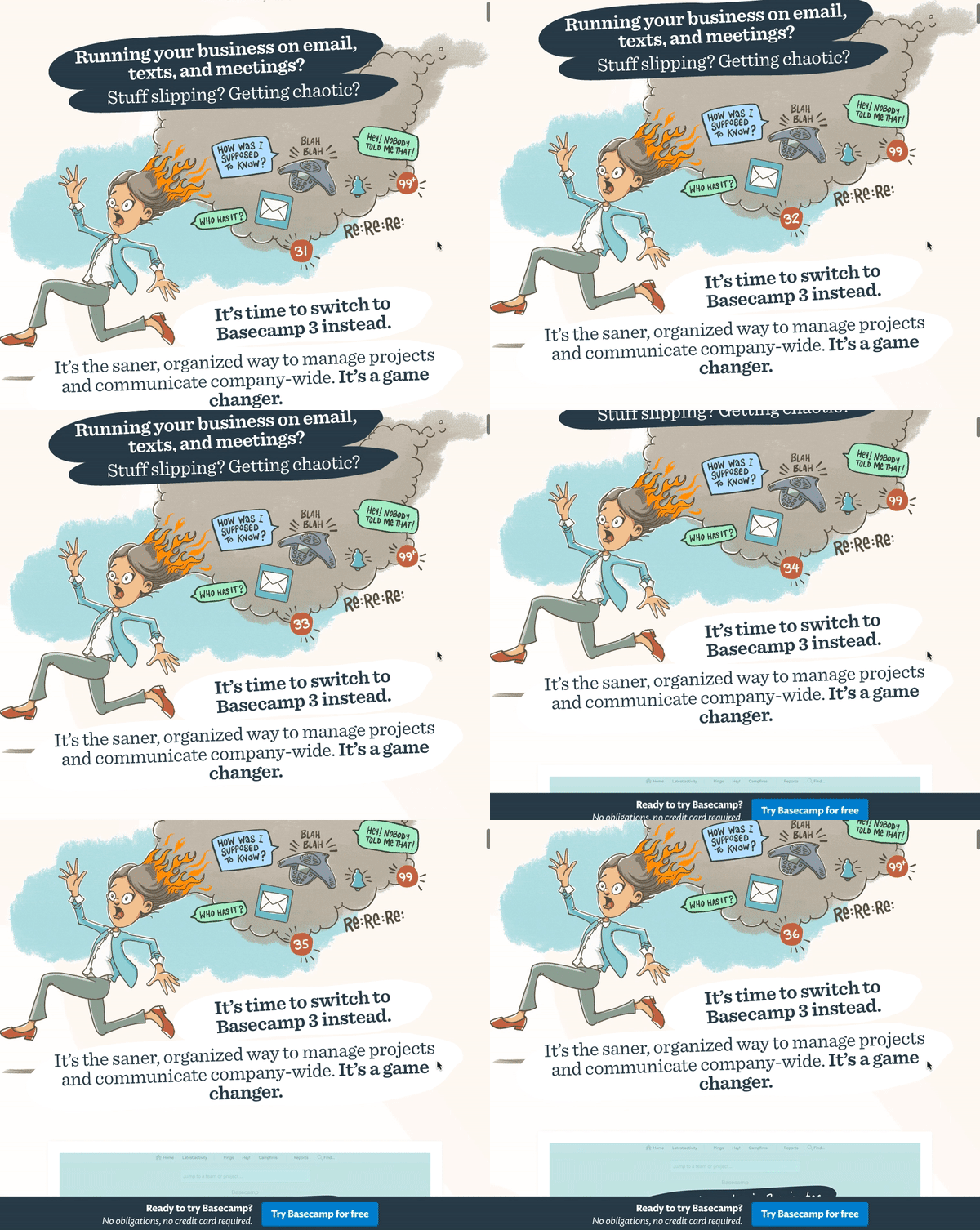
Here's an example of a banner on Basecamp's homepage, which appears when you scroll a certain percentage of the way down the page:
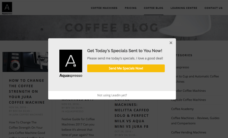
This overlay modal from Aquaspresso's blog offers blog readers an avenue toward their paid products in a way that's helpful (providing a discount):
If you're looking for a good free tool to get started with pop-up forms, we'd recommend you try HubSpot Marketing Free. We built the Lead Flows feature within this free tool to help marketers generate more leads across their entire website without sacrificing the user experience.
6) Intuitive design and thoughtful CTA placement
The point of your website is to guide site visitors toward the actions you want them to take. Your conversion efforts will be far more compelling when assets are easy to find and are built with a reader-centric mindset. Think about how you can use layout, CTA placement, whitespace, colors, fonts, and other supporting elements to clearly communicate your value proposition, help visitors find specific information easily, and build trust.Most importantly, you'll want to make sure your webpages -- especially your most popular ones, like your homepage -- are designed beautifully, intuitively, and with lead generation in mind. In other words, you'll want to direct your visitors' attention to the areas of the page that will convert them into leads.
For example, according to an eye tracking study, a website reader's natural eye path starts in the upper left-hand corner of a website and moves on from there in an F-pattern. To take advantage of this pattern, you may want to place your most important calls-to-action somewhere within that F-pattern. (Read this blog post to learn more about designing webpages for lead generation.)
In the example below, the business' name is in the top left, followed by the horizontal navigation bar placed on the top, and a primary call-to-action (by #4) in the second row.
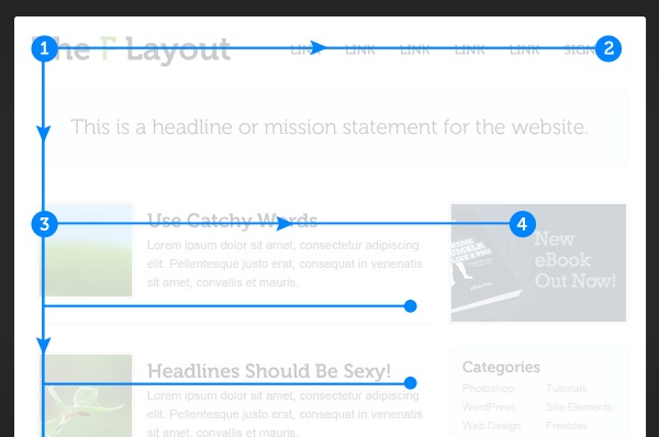
Image Credit: Envato Studio
7) A blog with lead-generating CTAs
If you don't have a business blog or aren't using it consistently, then you're missing out on a huge traffic- and lead-driving engine. There are many business benefits to blogging, which not only include helping drive traffic to your website, but also converting traffic into leads for your business. Just like every blog post you write is another indexed page, each post is a new opportunity to generate new leads. And thanks to the compounding value of blog posts over time, every post you write will drive value for you in the form of traffic and leads not just when you first publish it, but for years to come.Here at HubSpot, our blog is responsible for a significant percentage of our marketing team's incoming leads -- and 76% of our monthly blog views come from posts published prior to the current month.
But in order to generate leads from your blog, you can't just write, hit "publish," and call it a day. You'll need to add a lead-generating call-to-action to every blog post that points to free content gated behind a landing page (see #4). To help you create these long-form offers more easily without worrying about the design component, try downloading these 386+ free content creation templates for ebooks, infographics, and other offers.
Once you create lead-generating offers, promote them by blogging about subject matters related to them, and then put CTAs that lead to the asset's landing page on every one of those blog posts.
8) Social proof and other trust-builders
In order for a site visitor to turn into a lead, they need to hand over some personal information -- their name, their email address, and maybe even their phone number or company name. Why would they give that information to you unless they felt some sort of trust in your brand and what you're offering them?That's where establishing credibility comes in. If you want to earn people's trust enough to compel them to opt in to your emails or otherwise put their personal information into your database, you're going to need to prove yourself somehow -- especially to people who don't know who you are quite yet. The most meaningful form of advertising is recommendations from others, and it can have a big impact on conversion rates.
There are many ways to establish credibility on your website. One effective way to show trustworthiness is by adding social proof -- like customer testimonials, case studies, and prominent client logos -- as well as trust seals to your site.
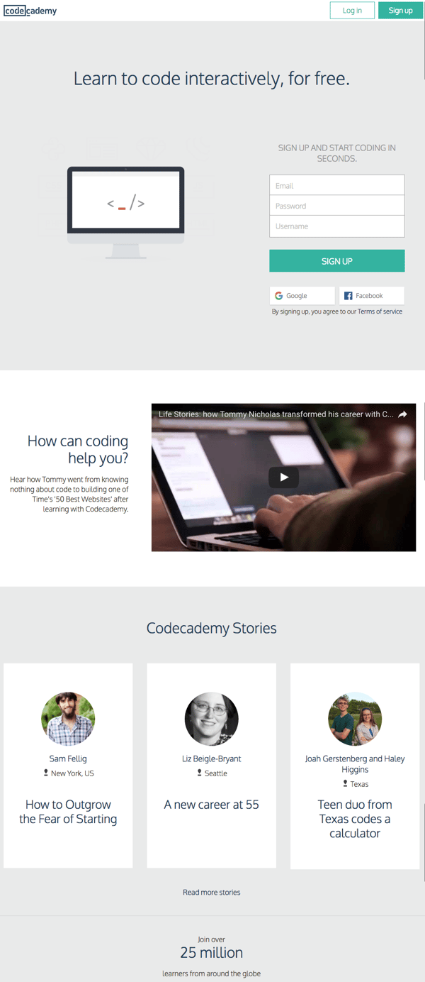
- Customer testimonials are quotes from real customers you can place on landing pages, your homepage, and anywhere else on your website. Place these quotes below forms, and be sure to include a photo, name, company, and job title. Here's a great example from Codecademy's homepage:
- Case studies are full-fledged customer stories, either written or in video. They're longer and more detailed than customer testimonials, and often include success metrics and positive results. You can learn more on how to create compelling case studies here.
- Prominent client logos are when a business places the logos of some of their more well-known clients on their homepage or elsewhere on their website to show them off. According to ConversionXL, logos from prominent clients tend to be memorable to site visitors.
- Trust seals are symbols that reassure site visitors that their sensitive information is secure with the company they're giving it to. (Read this post to learn more about adding trust seals to your website.)

There you have it. Now, these are by no means the only components of a website that can or should be optimized for lead generation. But this guide will help you get started with the fundamental components you'll need to generate more and higher quality leads.
And although we've gone over some overarching best practices, remember that you'll need to continuously test and tweak your site to optimize it for leads based on your own, unique audience. If you aren't doing that already or want to learn more about optimization, read this post to learn about A/B testing your website in more detail.
What else makes up a lead-generating website? Share with us in the comments.


